Truro Agromart 
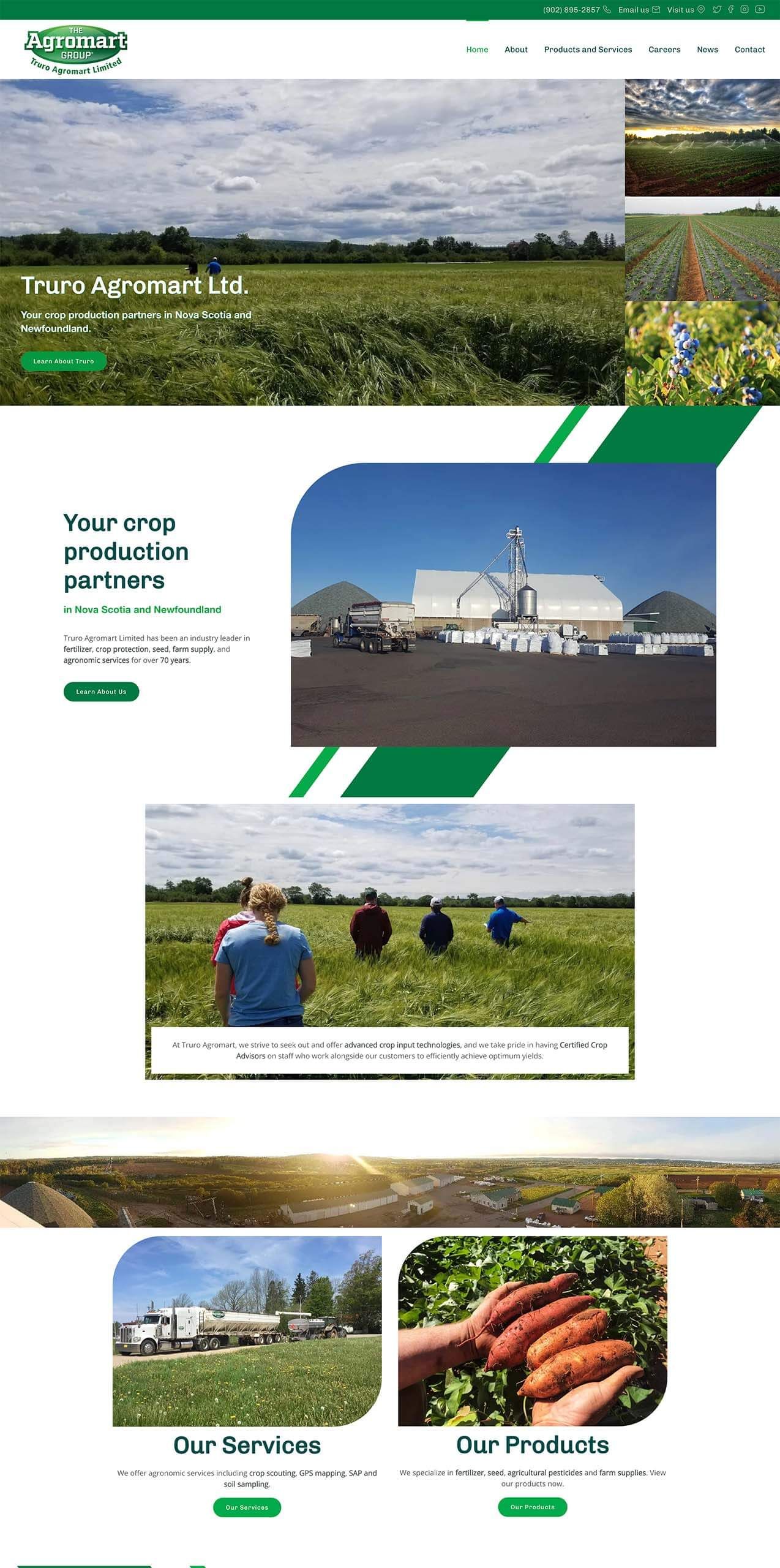
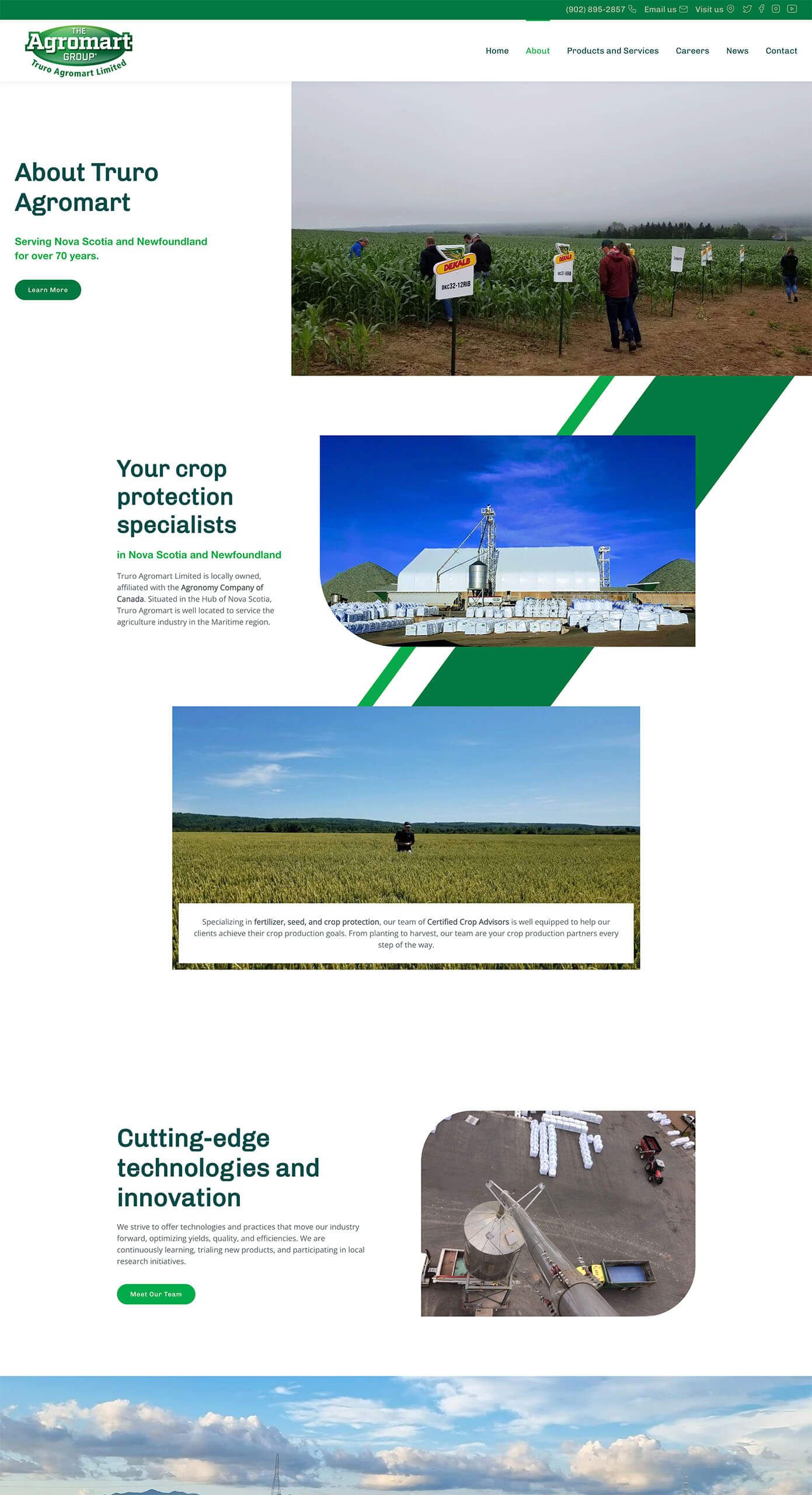
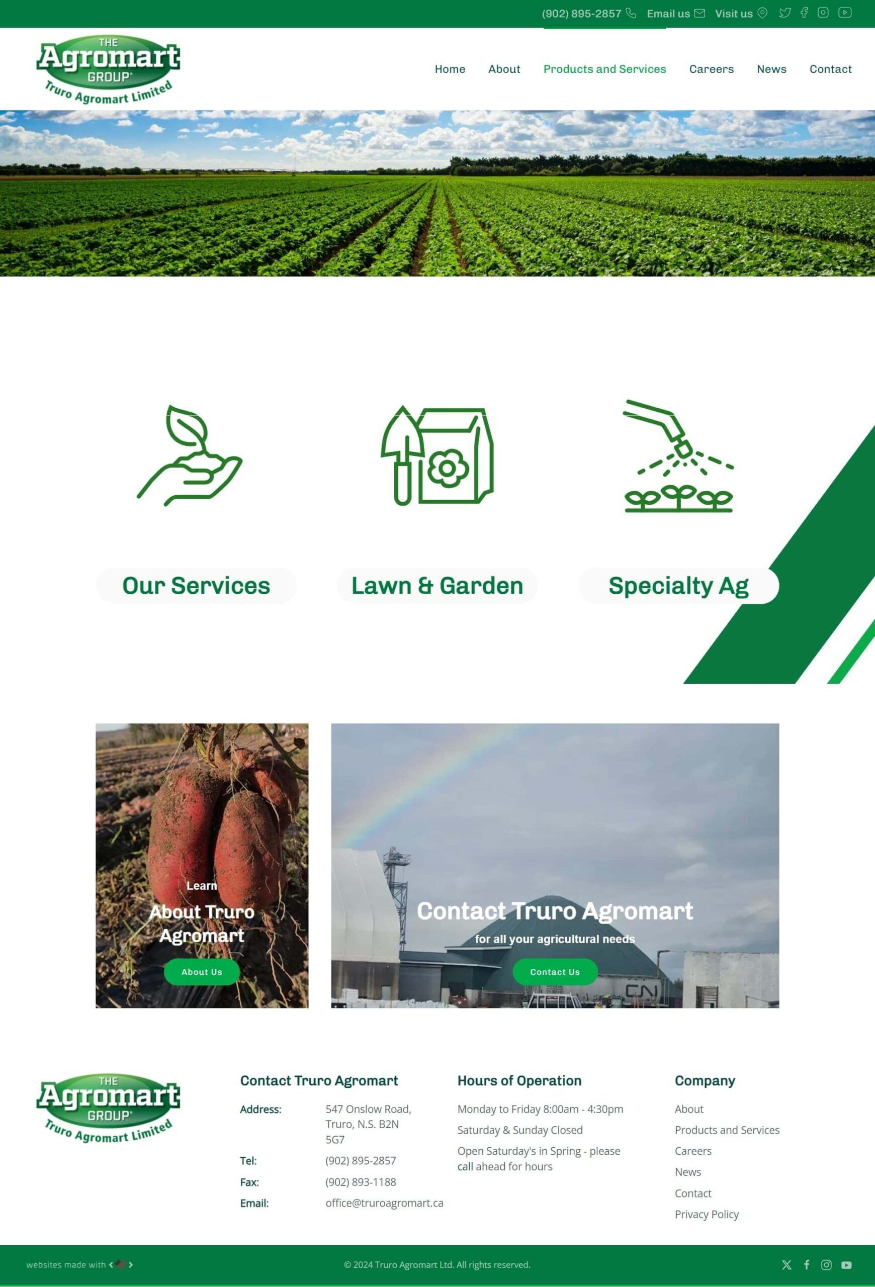
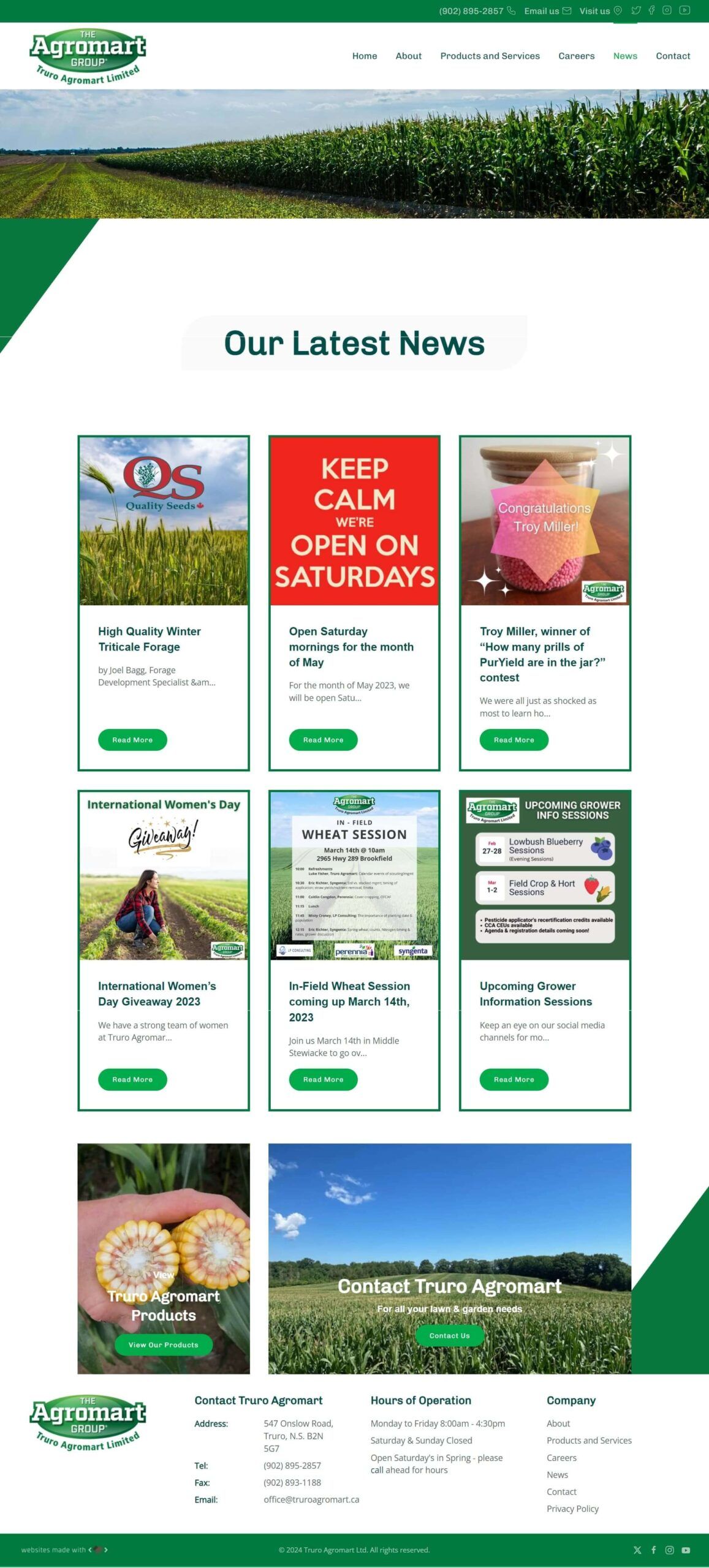
Truro Agromart approached us with beautiful agriculture imagery from Nova Scotia. They are looking for a website that would both stand out and displays those amazing imagery among the agricultural industry. Their goal was to effectively display their crop services, customer relationships, and extensive agricultural expertise with a modern, visually engaging designa aligning with the concept of the Agromart group.
- An inviting, agriculture-focused design emphasizing Nova Scotia’s landscapes
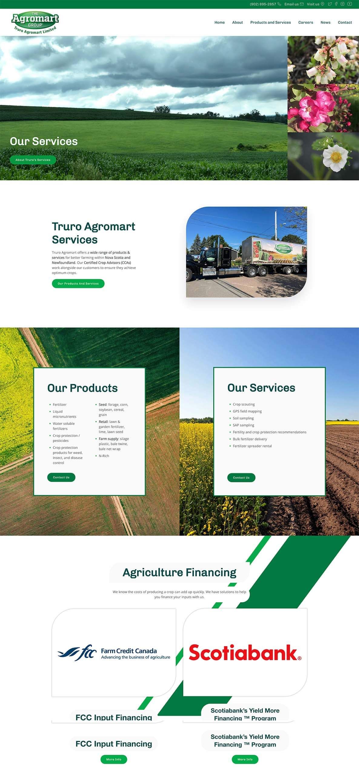
- Sections dedicated to products and services
- Adding a news page for customer resources updates and guidance
- Form integration for customer inquiries and requests
What We Delivered 
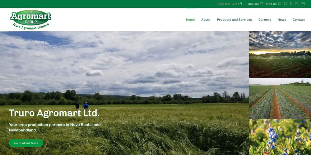
Beginning with a gallery-style hero section on the homepage, Truro Agromart’s site uses stunning agricultural imagery from Nova Scotia to capture the viewer’s attention. Light and dark greens dominate the color palette, tying the site’s aesthetic to Truro Agromart’s brand and creating a fresh, approachable look.
Key sections on the website focus on crop nutrients, services, and valued partnerships, all presented in an organized and visually appealing format. We ensured the content layout keeps users engaged and strategically placed call-to-action buttons make it easy for customers to connect with Truro Agromart.
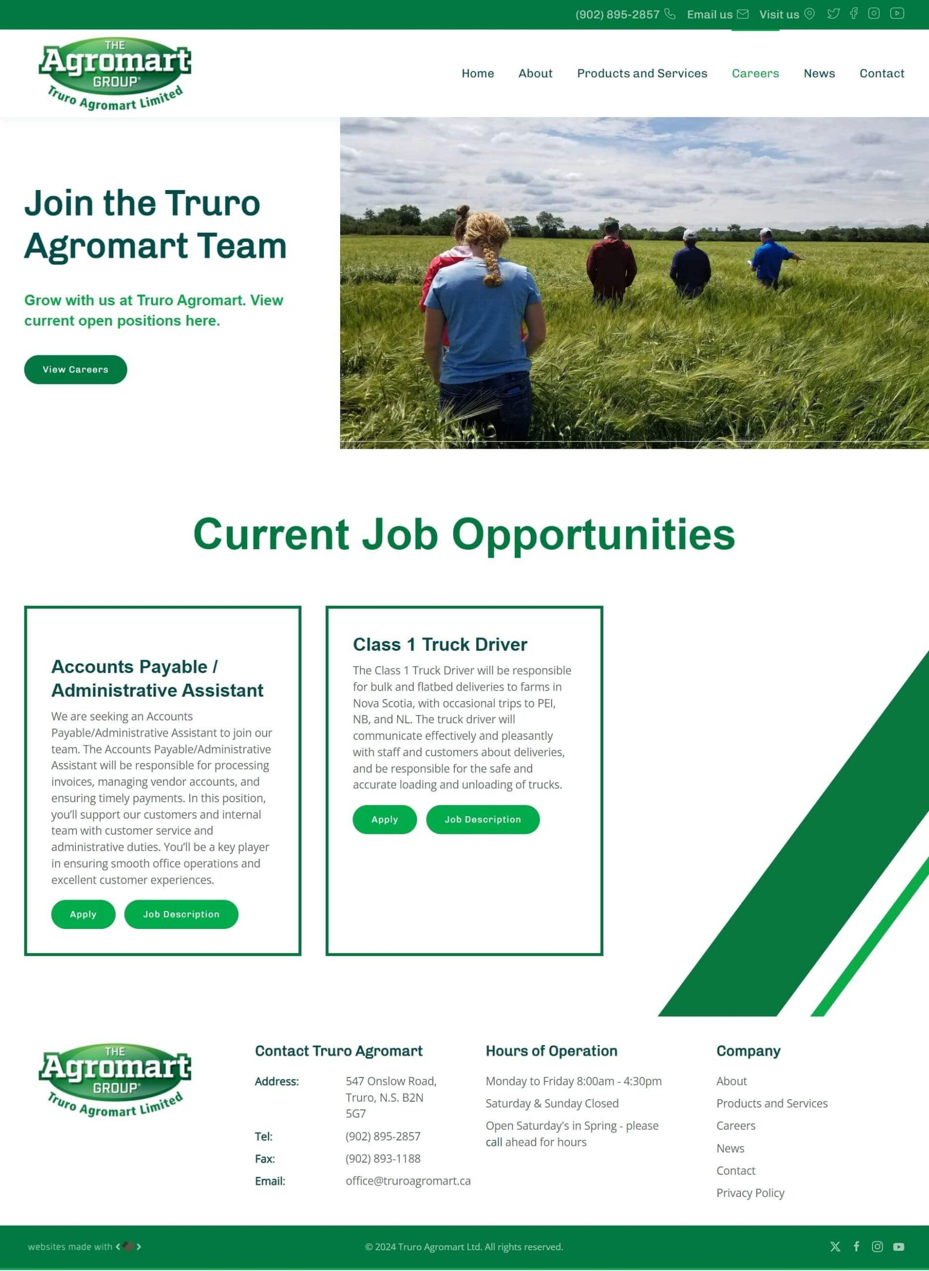
A dedicated careers page with an application form enables prospective employees to apply directly on the site. Job descriptions, application forms, and upload features streamline the process.
By using light and dark green hues along with rounded imagery, borders, and custom icons, the design is inviting yet professional. The scrollable diagonal line effect adds a modern touch to Truro Agromart’s site, creating a visually engaging experience that aligns perfectly with their agricultural brand and commitment to Nova Scotia’s vibrant landscape.
Beginning with a gallery-style hero section on the homepage, Truro Agromart’s site uses stunning agricultural imagery from Nova Scotia to capture the viewer’s attention. Light and dark greens dominate the color palette, tying the site’s aesthetic to Truro Agromart’s brand and creating a fresh, approachable look.
Key sections on the website focus on crop nutrients, services, and valued partnerships, all presented in an organized and visually appealing format. We ensured the content layout keeps users engaged and strategically placed call-to-action buttons make it easy for customers to connect with Truro Agromart.
and clients
A dedicated careers page with an application form enables prospective employees to apply directly on the site. Job descriptions, application forms, and upload features streamline the process.
By using light and dark green hues along with rounded imagery, borders, and custom icons, the design is inviting yet professional. The scrollable diagonal line effect adds a modern touch to Truro Agromart’s site, creating a visually engaging experience that aligns perfectly with their agricultural brand and commitment to Nova Scotia’s vibrant landscape.
A complete redesign of the website means Hoegy’s can offer more than a “coming soon” banner to their customers. We kept the navigation menu simple, with “Services” as one of the first choices. We organized their services into categories such as fertilizer, crop protection, seed, custom application, agronomic advice, and farm supply. Each category leads the visitor to a page about that service, often including a gallery and description of available products, video clips, and additional information. We followed a conventional design to make it more intuitive for visitors.
People are much more likely to visit a website if there contains what they are looking for. We improved Hoegy’s website traffic by creating custom content that answers questions from the perspective of the visiting client. Simple lists, short descriptions, and photos allow the visitor to know very quickly what Hoegy’s has to offer. Carefully placed call-to-action (CTA) buttons with mail or phone icons also help visitors contact Hoegy’s directly, without having to hunt for that information either.
The website now acts as a “one-stop-shop” for clients, employees, and prospective employees that provides the right amount of information each is seeking out. Clients are able to easily navigate through the website and contact Hoegy’s with any questions or concerns. Likewise, employees can also navigate through to double-check product lists and suppliers. Potential employees are also able to view current job listings by clicking a button right on the homepage. This is all done without having an excessive amount of information for clients to process. It’s to the point and immediately answers questions like “Does Hoegy’s carry X product?” or “Are there any job openings at Hoegy’s?” That’s functional in our books!
The main focal point of the homepage was to be the Hoegy’s Farm Supply Ltd. logo as the logo is very engaging and unique. Our graphic designer created their logo as an animated svg for strong engagement. We focussed on a modern white look with a color pallette of orange and green from the Hoegy’s logo. Green hover border effects were added to increase engagement. The services section featured video content, easy navigation, and embedded Seed Guides (as PDFs) for customers to download. A careers page was also added with functional application form for prospective employees.
The new Agconnexion Portal is easily accessible from a button at the top right corner of the page. This secure login portal for employees allows for quick access to important company resources without dampening the user experience for clients.
