The Agromart Group 

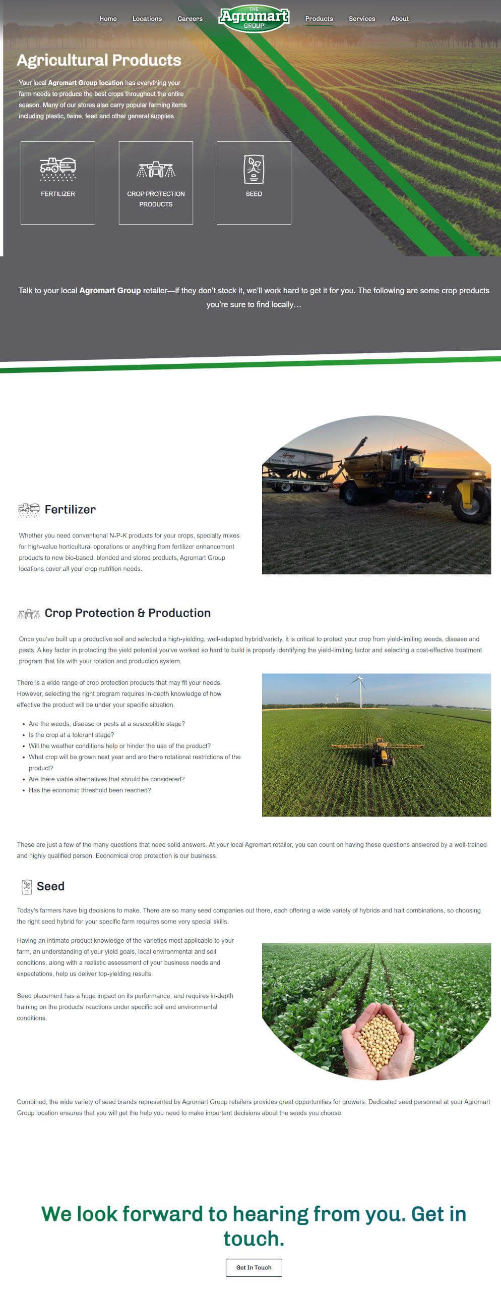
Agromart Group needed a new website to replace its outdated, overly complex, and video-heavy site. They wanted a simplified, user-friendly design that focused on their network of dealers and streamlined the job posting process.
- A simplified, visually appealing design.
- A comprehensive dealer locator page.
- A functional and easy-to-update careers section.
- Enhanced accessibility features.
What We Delivered 
security
online presence
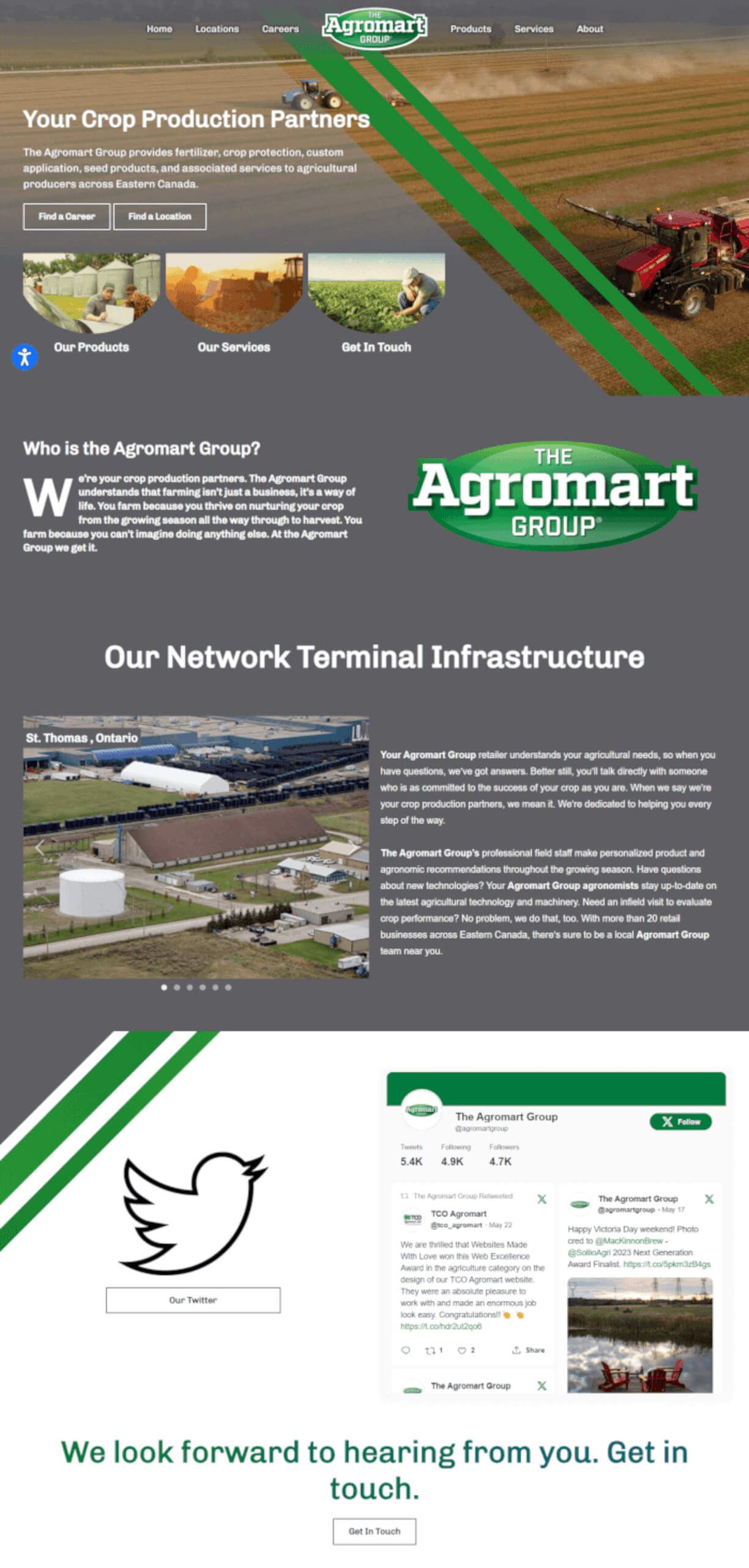
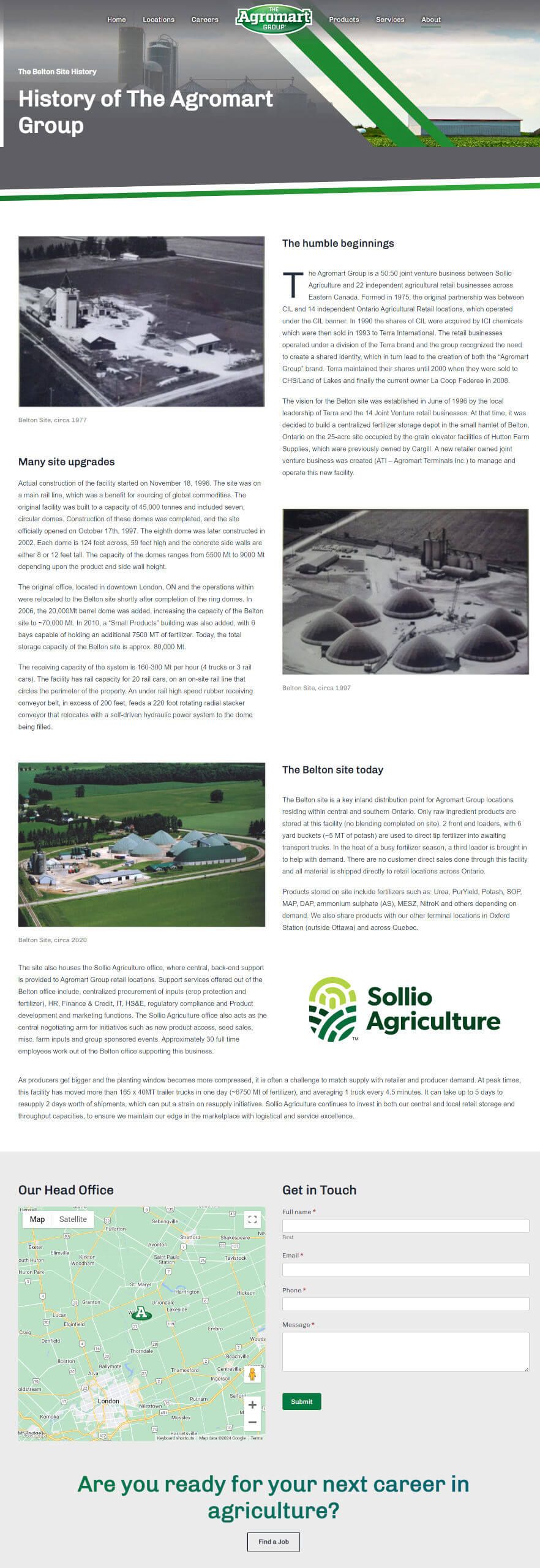
Agromart Group’s website was transformed from a cumbersome, video-heavy Drupal site into a sleek, user-friendly platform. The new design emphasizes clarity and easy navigation, ensuring visitors can find information quickly and efficiently. The branding is consistent with Agromart Group’s identity, featuring grey and green linework and rounded images to maintain visual cohesion.
security
page
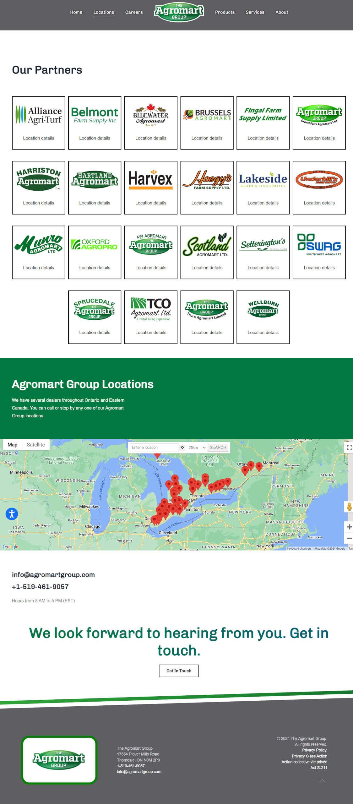
We developed a comprehensive dealer locator page that allows users to view all dealers in one place. The page is designed to be neutral, with all dealers listed alphabetically without prioritization. This ensures fairness and ease of use, allowing users to find their nearest dealer quickly. Clicking on a dealer provides detailed location information.
section
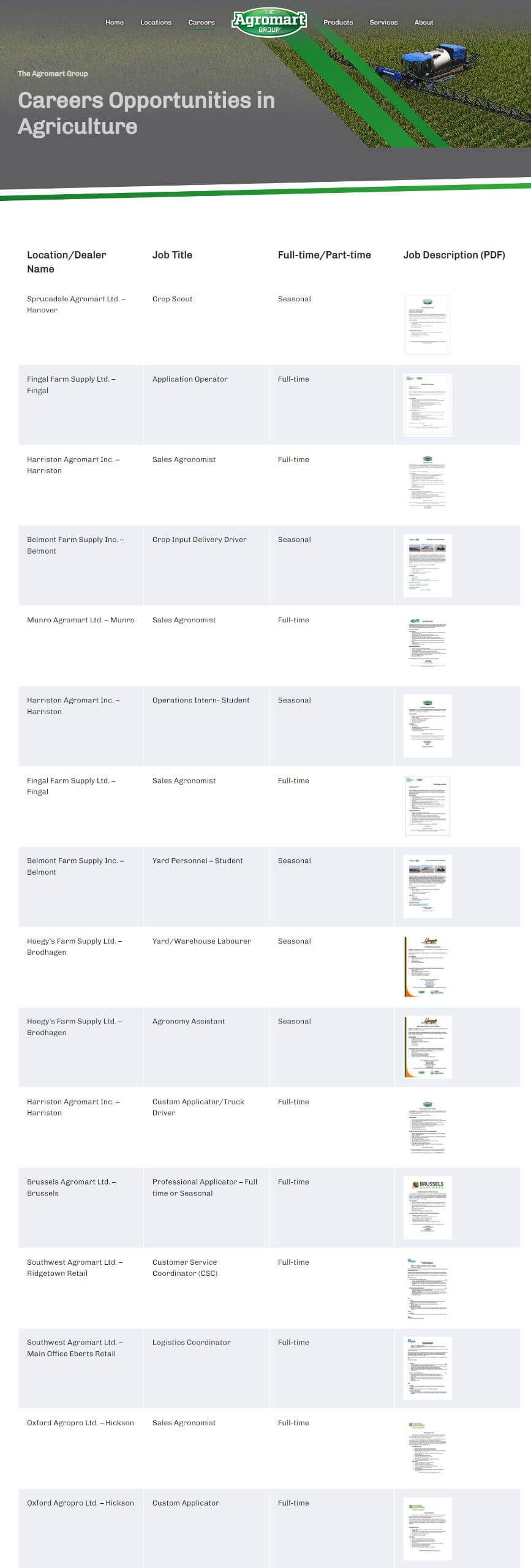
To facilitate job postings, we created a custom “Submit a Job” page. This page allows authorized users to upload job descriptions easily. The process is straightforward: users fill out a form with job details and upload the relevant PDF. The jobs then appear in a table format, allowing potential applicants to view and apply for available positions effortlessly.
use navigation
accessibility
We ensured the website is accessible to all users, in compliance with Ontario’s accessibility laws. Features include high-contrast color options and a screen reader mode, making the website usable for visitors with vision impairments. This commitment to accessibility demonstrates Agromart Group’s dedication to inclusivity.
design to attract
and design
The new website incorporates Agromart Group’s branding throughout, using grey and green linework and custom icons. The design is crisp and structured, highlighting the organization’s partners and services effectively. The homepage prominently features their branding and social media presence, particularly their Twitter feed, to keep visitors engaged and informed.
