Munro Agromart Ltd. 

Munro’s existing digital presence had good foundations, but needed structure, clarity, and ownership. Their website, social media channels, and Google My Business listing all required a cohesive strategy and a rebuild that reflects who they are today.
- A modern website with clean navigation and better readability
- A proper structure for Services and Products
- Consistent branding across all platforms
- Better homepage content (map, contact info, story, team)
What We Delivered 
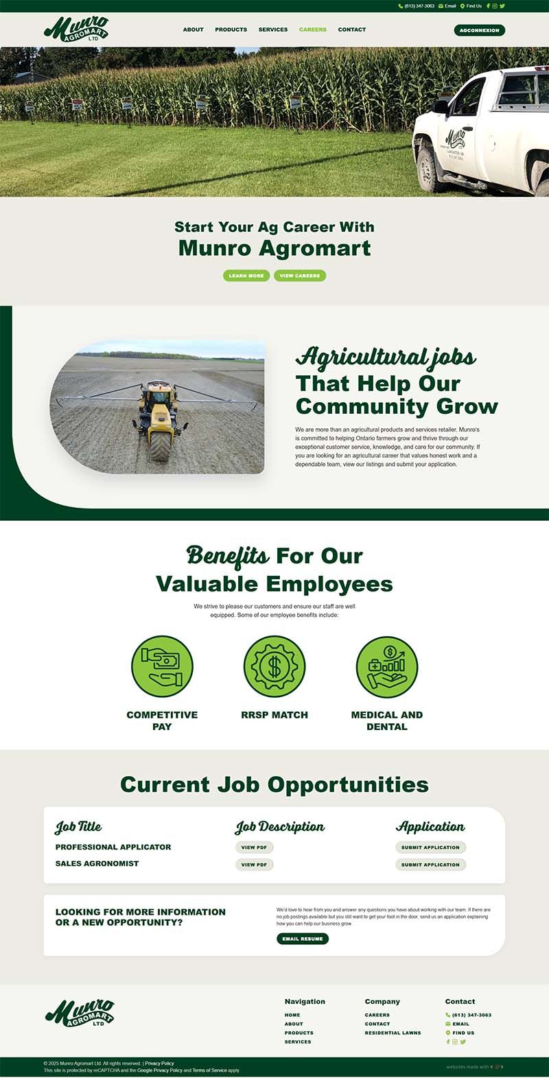
We rebuilt the entire site using WordPress and YOOtheme, creating six core pages with cleaner structure, less whitespace, improved readability on all devices, and a navigation system modeled after proven agricultural designs with Munro’s green branding.
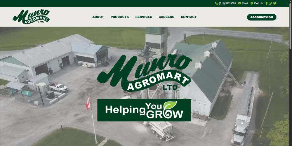
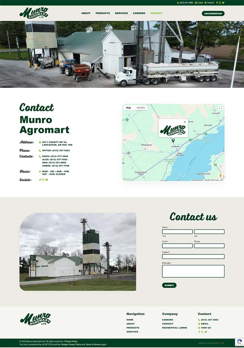
The homepage now includes a Google Map pin, streamlined contact details, an internal submission form with assigned handling, a refined Munro story, a full Meet the Team section, Agromart partnership recognition, and an on-brand “Helping you grow” tagline.
With beige/grey tones, strong logo placement, consistent tagline font, curated images and videos, and a layout inspired by proven agricultural sites, Munro’s online presence now feels warm, professional, and on-brand.
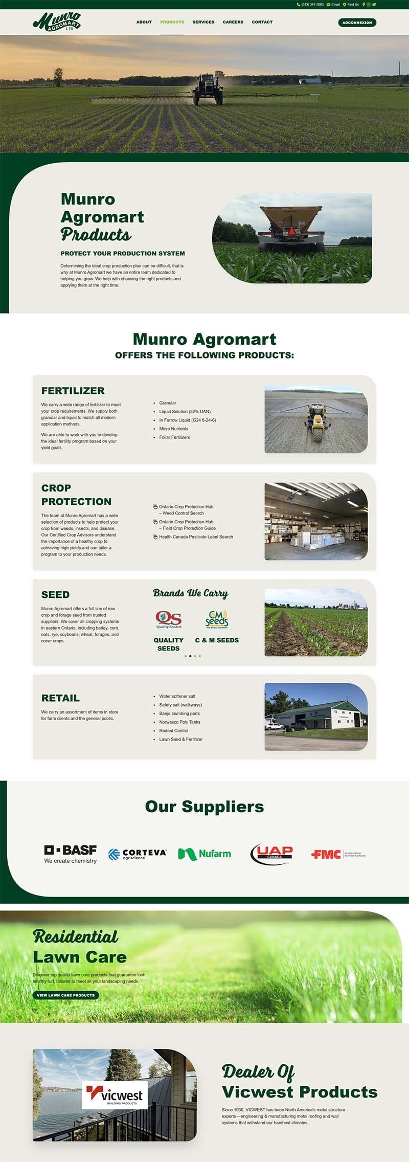
Services and Products were combined into two comprehensive, clearly written pages that organize offerings into intuitive sections with straightforward descriptions and a clean layout that helps customers quickly understand what Munro provides.


