Holmes Agro 
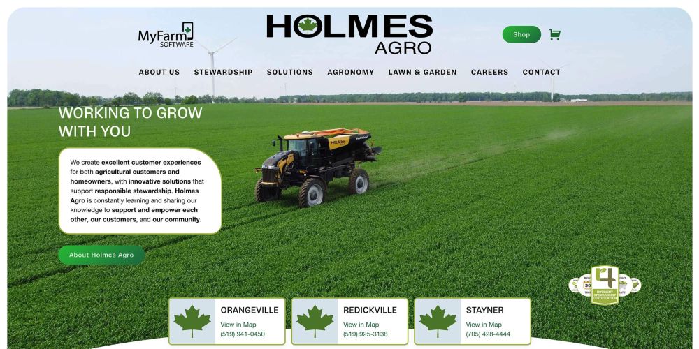
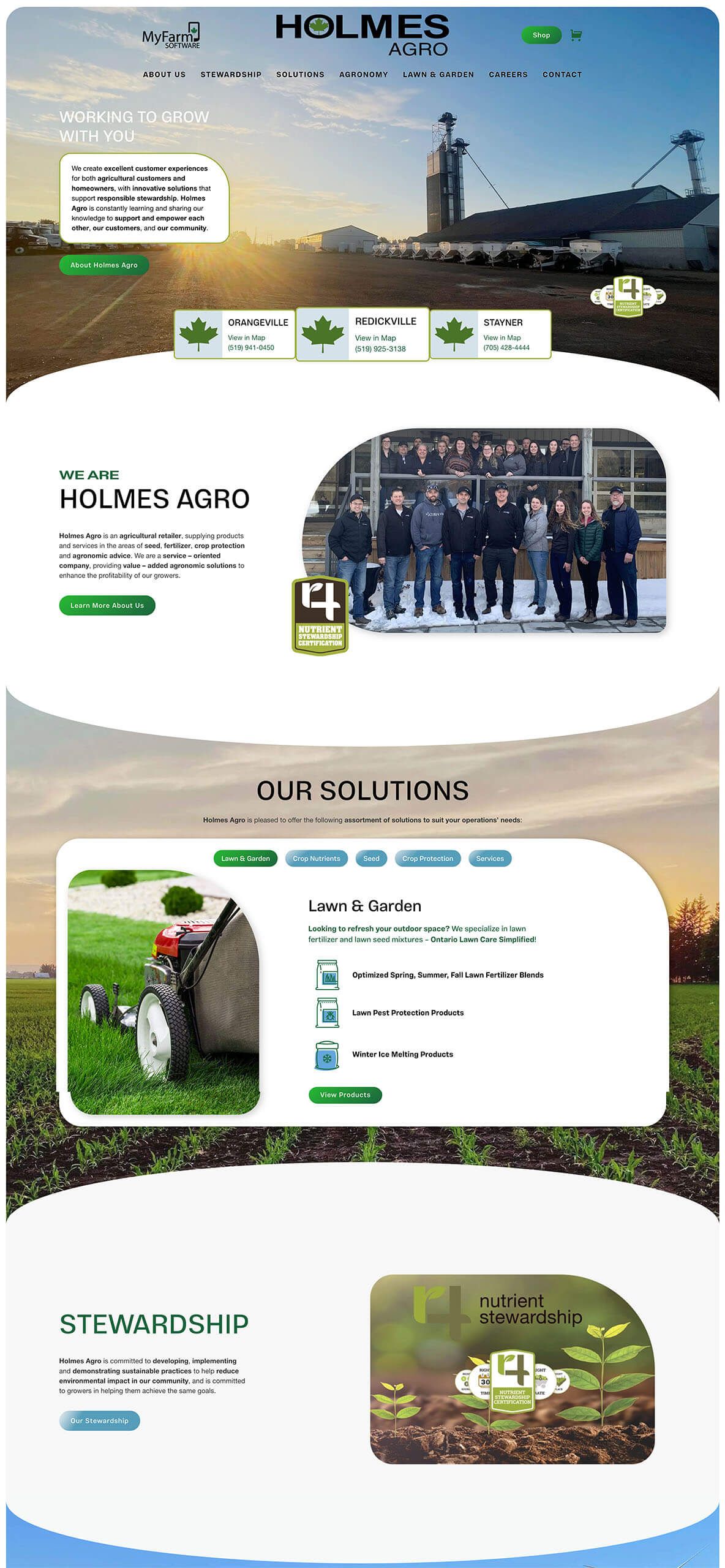
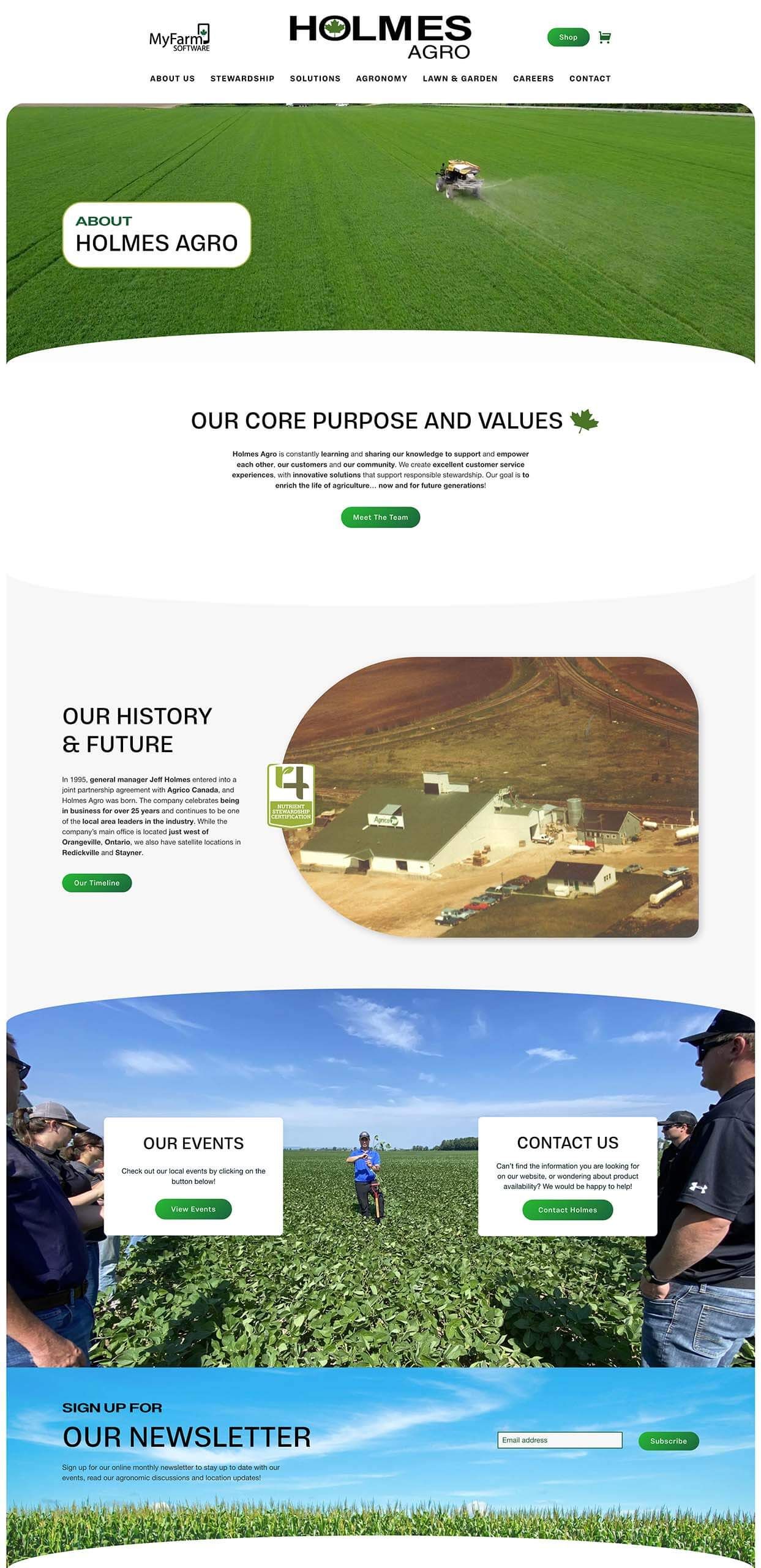
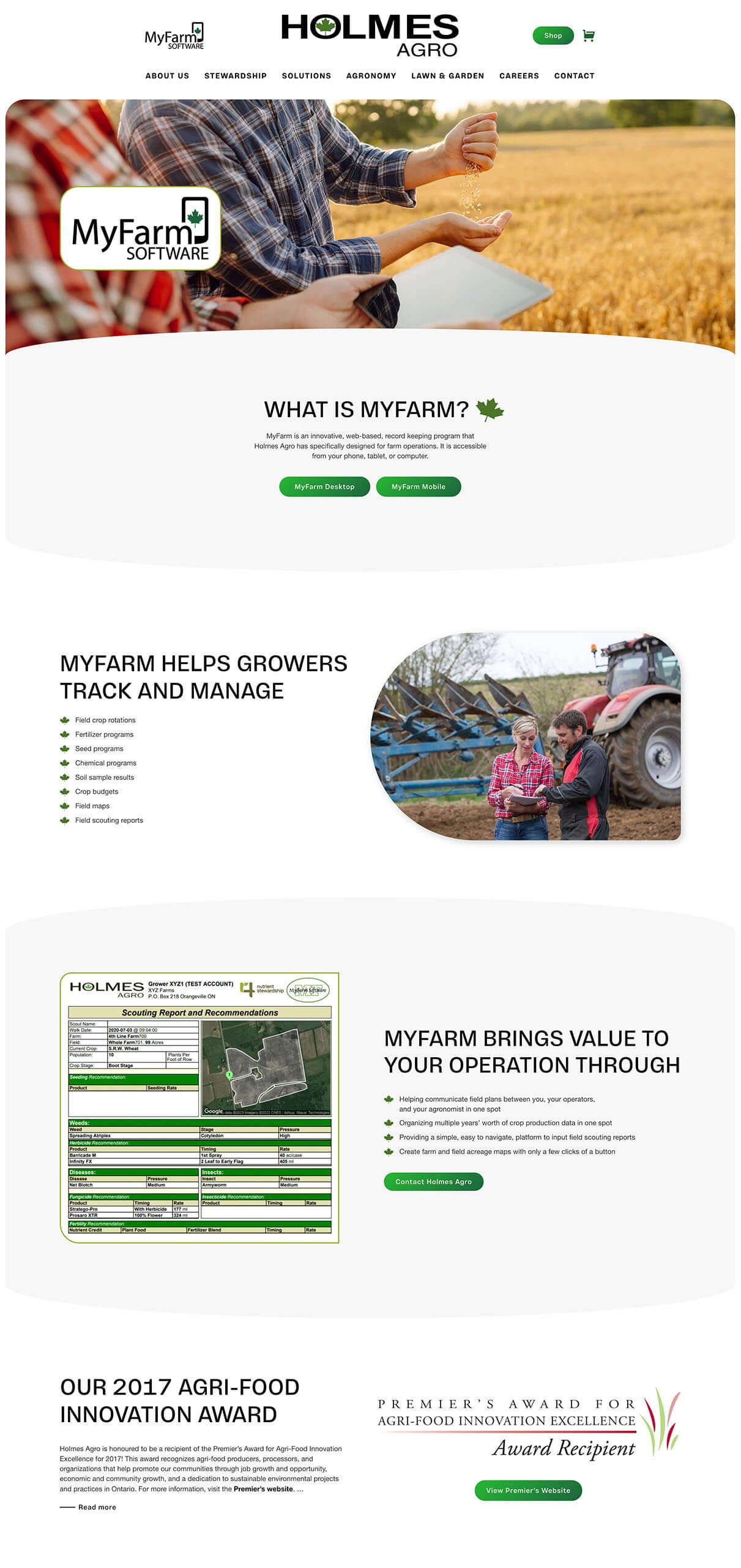
Holmes Agro approached us looking for a way to stand out and differentiate itself in the competitive agricultural industry. They needed an intuitive, vibrant website that would highlight their dedication to Ontario’s farming community. We added e-commerce functionality for their lawn and garden products, along with interactive features to engage and inform users.
- Rounded-edge sections for a unique visual appeal
- Strong, bold typography to enhance brand identity
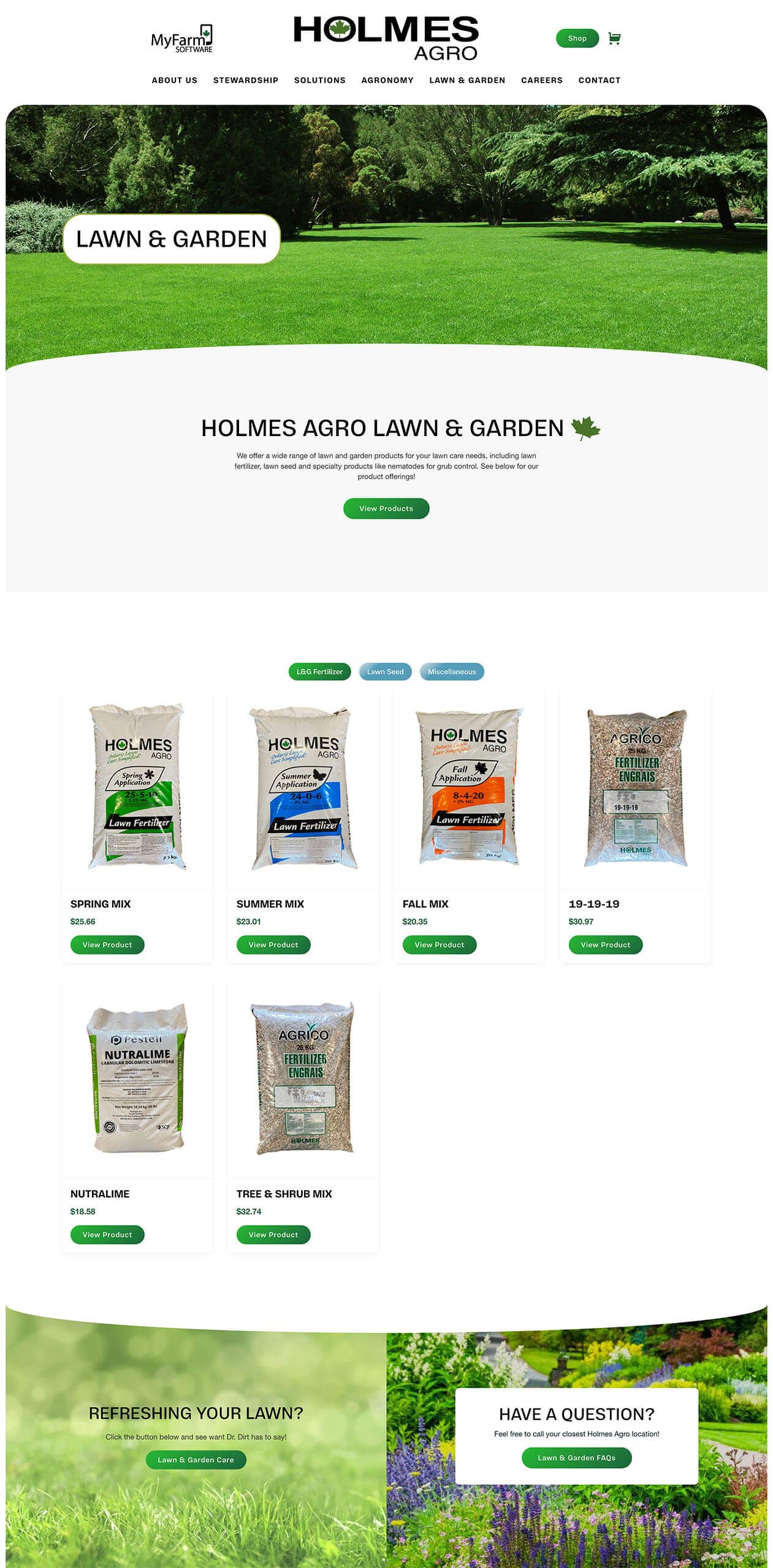
- E-commerce capabilities for lawn and garden products
- Enhanced functionality
- Embedded videos to showcase community impact
What We Delivered 
Holmes Agro’s website was crafted with rounded-edge sections, giving it a fresh, modern look. The green Canadian flag icon we integrated reinforces the brand’s local pride, and our use of custom icons adds a unique touch. Bold, clear typography emphasizes the brand’s identity, while the soft gradient color palette enhances visual appeal.
We structured the site to include various interactive elements—sliders, grids, and modals—making it easy for users to explore products, learn about Holmes Agro’s services, and understand its commitment to stewardship. The site’s navigation ensures accessibility and guides users through the content seamlessly.
The new e-commerce feature streamlines purchasing for Holmes Agro’s lawn and garden products, giving customers a convenient way to shop directly from the website without the need of their old Shopify. This feature aligns with their goal to expand into new product categories while enhancing user experience.
Stewardship is a core value for Holmes Agro, so we embedded videos in the hero sections to reflect their dedication to environmental care and community support. This added interactivity allows users to feel more connected with the brand’s mission, enhancing overall engagement and trust.
Holmes Agro’s website was crafted with rounded-edge sections, giving it a fresh, modern look. The green Canadian flag icon we integrated reinforces the brand’s local pride, and our use of custom icons adds a unique touch. Bold, clear typography emphasizes the brand’s identity, while the soft gradient color palette enhances visual appeal.
We structured the site to include various interactive elements—sliders, grids, and modals—making it easy for users to explore products, learn about Holmes Agro’s services, and understand its commitment to stewardship. The site’s navigation ensures accessibility and guides users through the content seamlessly.
and clients
The new e-commerce feature streamlines purchasing for Holmes Agro’s lawn and garden products, giving customers a convenient way to shop directly from the website without the need of their old Shopify. This feature aligns with their goal to expand into new product categories while enhancing user experience.!
Community
Stewardship is a core value for Holmes Agro, so we embedded videos in the hero sections to reflect their dedication to environmental care and community support. This added interactivity allows users to feel more connected with the brand’s mission, enhancing overall engagement and trust.
A complete redesign of the website means Hoegy’s can offer more than a “coming soon” banner to their customers. We kept the navigation menu simple, with “Services” as one of the first choices. We organized their services into categories such as fertilizer, crop protection, seed, custom application, agronomic advice, and farm supply. Each category leads the visitor to a page about that service, often including a gallery and description of available products, video clips, and additional information. We followed a conventional design to make it more intuitive for visitors.
People are much more likely to visit a website if there contains what they are looking for. We improved Hoegy’s website traffic by creating custom content that answers questions from the perspective of the visiting client. Simple lists, short descriptions, and photos allow the visitor to know very quickly what Hoegy’s has to offer. Carefully placed call-to-action (CTA) buttons with mail or phone icons also help visitors contact Hoegy’s directly, without having to hunt for that information either.
The website now acts as a “one-stop-shop” for clients, employees, and prospective employees that provides the right amount of information each is seeking out. Clients are able to easily navigate through the website and contact Hoegy’s with any questions or concerns. Likewise, employees can also navigate through to double-check product lists and suppliers. Potential employees are also able to view current job listings by clicking a button right on the homepage. This is all done without having an excessive amount of information for clients to process. It’s to the point and immediately answers questions like “Does Hoegy’s carry X product?” or “Are there any job openings at Hoegy’s?” That’s functional in our books!
The main focal point of the homepage was to be the Hoegy’s Farm Supply Ltd. logo as the logo is very engaging and unique. Our graphic designer created their logo as an animated svg for strong engagement. We focussed on a modern white look with a color pallette of orange and green from the Hoegy’s logo. Green hover border effects were added to increase engagement. The services section featured video content, easy navigation, and embedded Seed Guides (as PDFs) for customers to download. A careers page was also added with functional application form for prospective employees.
The new Agconnexion Portal is easily accessible from a button at the top right corner of the page. This secure login portal for employees allows for quick access to important company resources without dampening the user experience for clients.
