Setterington Fertilizer
Service Ltd. 
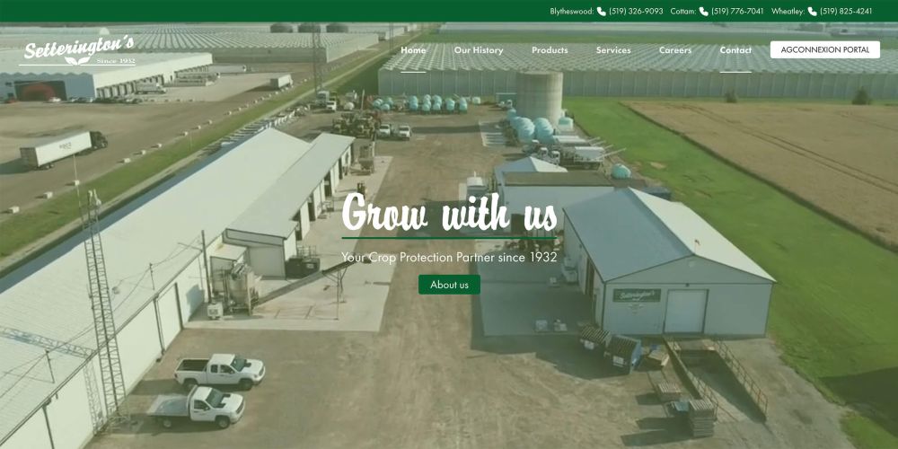
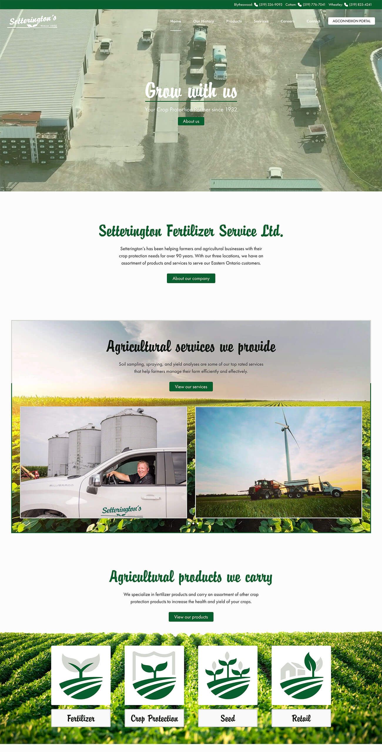
Setterington’s Fertilizer Services Ltd. approached us with a goal to bring a fresh, cohesive, professional look that reflects their brand’s history. Our goal was to design a site that preserved the classic elements of their branding while introducing a modern, accessible interface.
- A streamlined, visually appealing homepage
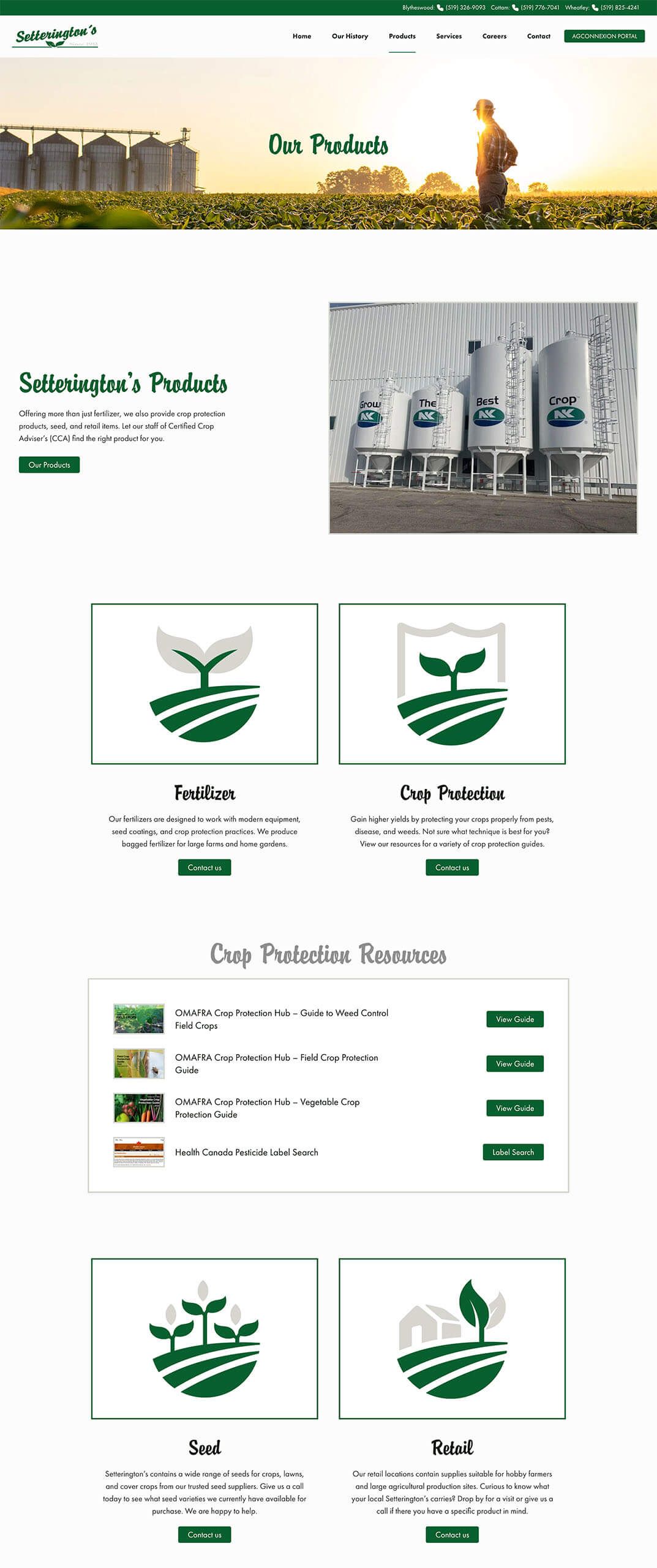
- Sections dedicated to their fertilizer products and services
- Multimedia elements for a dynamic home hero and subpage sections
- Custom icons and visuals aligned with their industry and brand identity
What We Delivered 
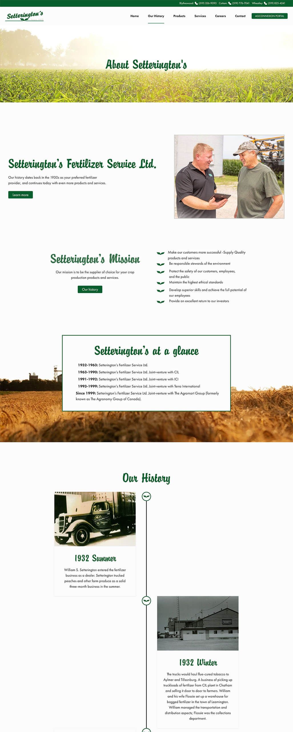
We integrated their signature typography with contemporary design elements, letting their unique, classic font shine throughout headlines and section titles. For accents, we used the leaf from their branding as a subtle motif on the timeline and section dividers. Thin borders and custom icons were designed for a clean and modern look.
The website’s layout ensures easy navigation with dedicated sections on fertilizer products, services, and company history. Content is clearly organized, making it simple for users to find information about Setterington’s offerings and connect with their team. This structure helps build trust, inviting engagement from both long-time clients and new visitors.
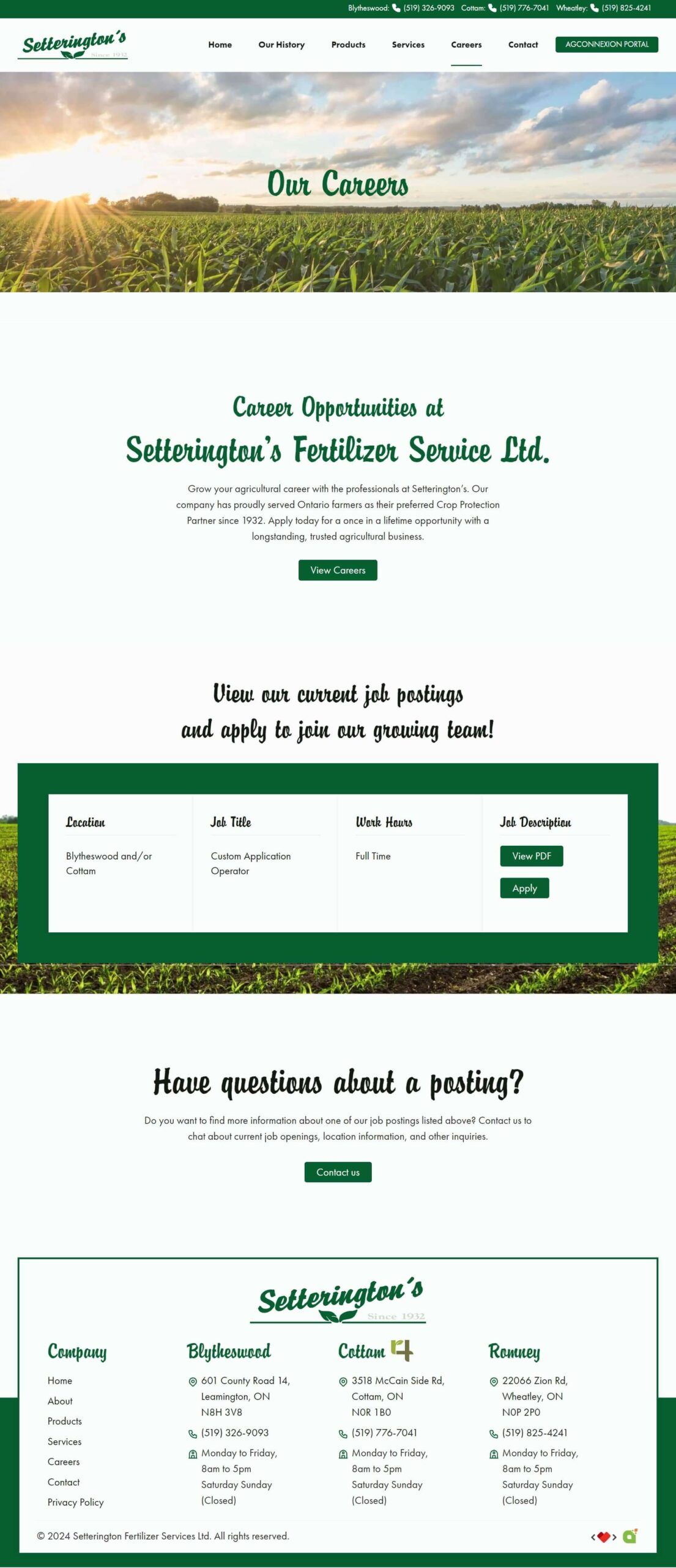
The website includes an interactive careers page with an integrated application form, where prospective employees can submit resumes directly. Custom icons distinguish Setterington’s product offerings. Also, providing easy navigation in guides and label search, making sure you are able to find your needs.
The design incorporates video elements provided by Setterington’s, bringing a dynamic touch to the website. Their branding colors are complemented by modern, subtle accents, creating an experience that is both visually appealing and accessible. Custom icons and thin-bordered imagery enhance readability and flow, all while staying true to Setterington’s brand identity.
We integrated their signature typography with contemporary design elements, letting their unique, classic font shine throughout headlines and section titles. For accents, we used the leaf from their branding as a subtle motif on the timeline and section dividers. Thin borders and custom icons were designed for a clean and modern look.
The website’s layout ensures easy navigation with dedicated sections on fertilizer products, services, and company history. Content is clearly organized, making it simple for users to find information about Setterington’s offerings and connect with their team. This structure helps build trust, inviting engagement from both long-time clients and new visitors.
Seamless Experience
The website includes an interactive careers page with an integrated application form, where prospective employees can submit resumes directly. Custom icons distinguish Setterington’s product offerings. Also, providing easy navigation in guides and label search, making sure you are able to find your needs.
The design incorporates video elements provided by Setterington’s, bringing a dynamic touch to the website. Their branding colors are complemented by modern, subtle accents, creating an experience that is both visually appealing and accessible. Custom icons and thin-bordered imagery enhance readability and flow, all while staying true to Setterington’s brand identity.
A complete redesign of the website means Hoegy’s can offer more than a “coming soon” banner to their customers. We kept the navigation menu simple, with “Services” as one of the first choices. We organized their services into categories such as fertilizer, crop protection, seed, custom application, agronomic advice, and farm supply. Each category leads the visitor to a page about that service, often including a gallery and description of available products, video clips, and additional information. We followed a conventional design to make it more intuitive for visitors.
People are much more likely to visit a website if there contains what they are looking for. We improved Hoegy’s website traffic by creating custom content that answers questions from the perspective of the visiting client. Simple lists, short descriptions, and photos allow the visitor to know very quickly what Hoegy’s has to offer. Carefully placed call-to-action (CTA) buttons with mail or phone icons also help visitors contact Hoegy’s directly, without having to hunt for that information either.
The website now acts as a “one-stop-shop” for clients, employees, and prospective employees that provides the right amount of information each is seeking out. Clients are able to easily navigate through the website and contact Hoegy’s with any questions or concerns. Likewise, employees can also navigate through to double-check product lists and suppliers. Potential employees are also able to view current job listings by clicking a button right on the homepage. This is all done without having an excessive amount of information for clients to process. It’s to the point and immediately answers questions like “Does Hoegy’s carry X product?” or “Are there any job openings at Hoegy’s?” That’s functional in our books!
The main focal point of the homepage was to be the Hoegy’s Farm Supply Ltd. logo as the logo is very engaging and unique. Our graphic designer created their logo as an animated svg for strong engagement. We focussed on a modern white look with a color pallette of orange and green from the Hoegy’s logo. Green hover border effects were added to increase engagement. The services section featured video content, easy navigation, and embedded Seed Guides (as PDFs) for customers to download. A careers page was also added with functional application form for prospective employees.
The new Agconnexion Portal is easily accessible from a button at the top right corner of the page. This secure login portal for employees allows for quick access to important company resources without dampening the user experience for clients.
